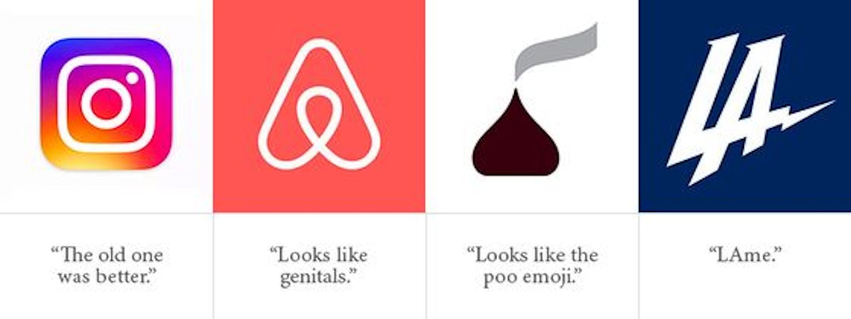
If you are a large, highly visible company, and you introduce a new logo, the internet will be more than happy to let you know they think it sucks. Instagram, Airbnb, Hersheys, and the Los Angeles Chargers are a few organizations whose new logos have encountered public ridicule over the past few years.

Unfortunately, public opinion can be an unreliable metric for determining a logo’s value. Sometimes the public reacts poorly to a new logo simply because it’s different.
Here are five points which can help you decide if your logo is a good candidate for replacement:
If your logo’s style is outdated, it might suck.
Some logos can make a good case for being timeless. The BMW logo, for instance, has remained largely unchanged since it was introduced in 1916. Most logos, however, tend to look like the period they were designed in. A logo that looked contemporary when your company was new may well look outdated when you compare it to all the newer logos which are competing for your customers’ attention.

If you haven’t reviewed your logo in more than 10 years, it might suck.
Businesses evolve, and so should your logo. You might offer a broader range of services now than when you started the business. Perhaps you’ve even pivoted enough to showcase a different set of products. In this case, your logo could be reminding people of who you were instead of who you are now. In 2003, UPS changed the logo they’d been using for over 40 years. It was part of a comprehensive rebranding campaign to announce that they were no longer just a company that moved parcels from one place to another.

If your logo isn’t designed to work on all screen sizes, it might suck.
Ten years ago, your logo only had to look good in print, on a fax sheet, and on a website which everyone was going to look at on a desktop computer. Then everything changed, screen sizes got smaller and rotated, and ever-increasing numbers of people are viewing your logo on smartphones. Now your logo must be readable and recognizable on all screen sizes. This includes the 16 x 16 pixel size of a favicon, the tiny icon in the tab or address window of a browser.
If you bought your logo from a stock photo/graphic company, it might suck.
You may have saved money on it, but you did not get a good deal. That same logo template had already been purchased by hundreds of other entrepreneurs, and will be purchased by hundreds more in the years to come. Sure, it may look professional and contemporary, but it will never look like your brand, and will never help your brand stand out.
If you designed your logo yourself, it might suck.
Or to be more diplomatic, you might not have the skill set create the most memorable logo, and give it the presentation and polish it deserves. You may not have had the time to devote to it. You may simply not have the expensive design tools to create production-ready files. Anyone can have an idea. It takes a trained, experienced, professional designer to breathe life into it.
So, does your logo suck?
If more than one of these five key points describes your logo, you ought to consider updating it. Contact Glyphix. We’re geniuses and really nice people to work with.

