How we did it for nero software...
Standing Out On The Shelf When Space Is Tighter Than Ever.

Background
Nero is a software company with a host of different products designed to help consumers manage all of their various digital media needs. Founded in 1995 and headquartered in Germany, with offices in Glendale, California, Nero is an industry leader whose products have reached over 100 million users through software purchases and over 1,000,000 downloads per month in 23 different languages.


What we did
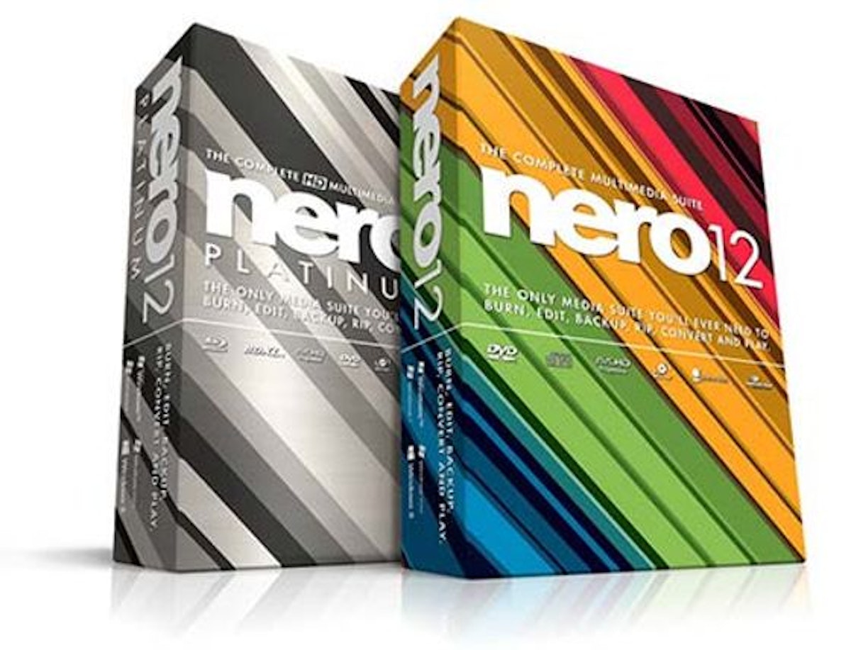
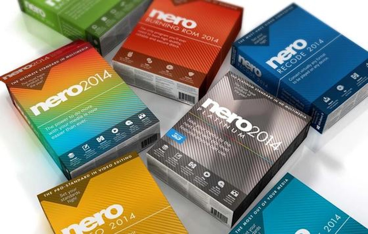
Sold in a traditional retail environment on store shelves in direct competition with similar products, the primary challenge with Nero came in designing packaging that would stand out and set them apart from other software options. A secondary challenge came in using the design to instantly communicate to consumers that the Nero Platinum software, the company’s flagship product and biggest seller, was an all-in-one suite of programs that could address a wide variety of user’s media needs. Once the Platinum package design was finalized, it would be extended to the other software packages, setting the tone and incorporating major elements to provide a comprehensive, unified look to the full line of Nero products.

In order to better understand the market all versions of the competitors’ packaging was analyzed for strengths and vulnerabilities. Then, multiple versions of the Platinum box design were presented to the Nero team with the various designs digitally placed into store shelves so a more informed decision could be made as to how the design looked in a real world, head-to-head competition.
After the final design was selected, the other packaging was developed, followed by package iterations in multiple foreign languages, collateral items such as sales sheets and more.

How it worked
The Nero team was happy enough with the design, and resultant worldwide sales, that they came back again the following year. And again. And again. And asked Glyphix to help them with a new, start up project called Stashimi; but that’s another story.
We have been working with Glyphix for the past several years and have been thrilled with their ideas and work product. I believe any firm would be thrilled to work with Larry and his creative team. <cite>Steve Martini, Managing Partner, Martini Iosue & Akpovi</cite>

