
How we did it for american jewish university...
An Education In Branding.
Background
The American Jewish University, or AJU, is a group of 10 diverse and distinct colleges each offering a unique field of study across a wide range of both Jewish and non-jewish areas of interest. From the Miller Introduction to Judaism Program to the Graduate School of Nonprofit Management college, the AJU is a well known and highly respected center of higher education among the religious and secular communities of Los Angeles.
The installation of a new Chancellor, and other management team members, meant a renewed focus on, among other things, student and alumni communications, and donor outreach. It was for projects related to these areas that Glyphix was called in to help.
What we did
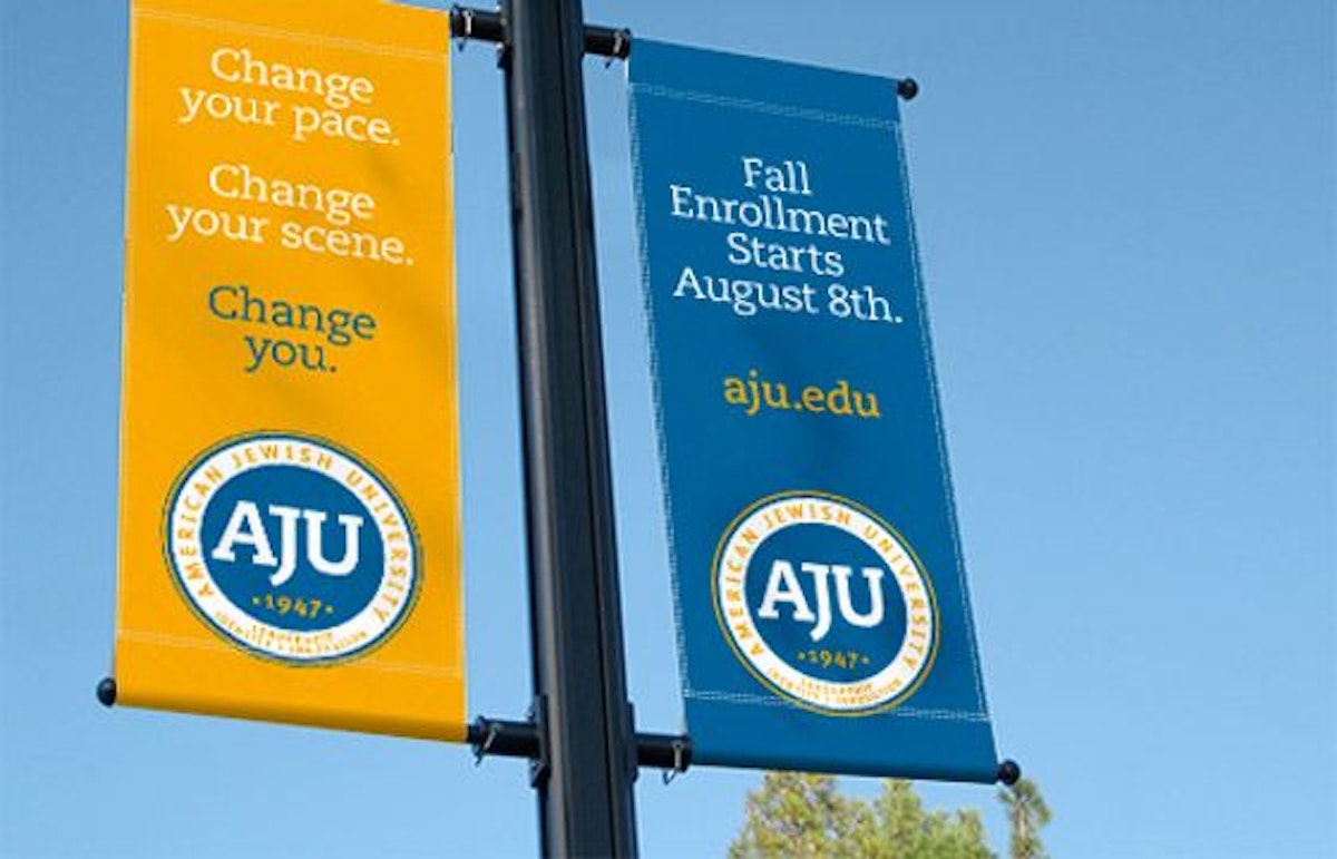
In addition to providing AJU schools with a unified and updated look to their existing e-communications to donors, Glyphix was tapped to bring a strong, cohesive visual structure to the AJU member schools by strengthening the overall brand. Up until the new management team was in place, each school operated with a great deal of autonomy from each other and had their own identities and visual approach; some more polished than others.
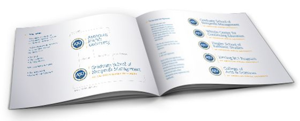
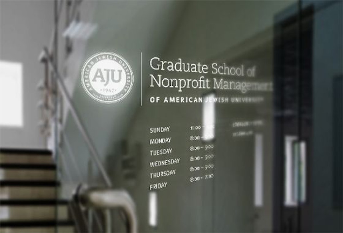
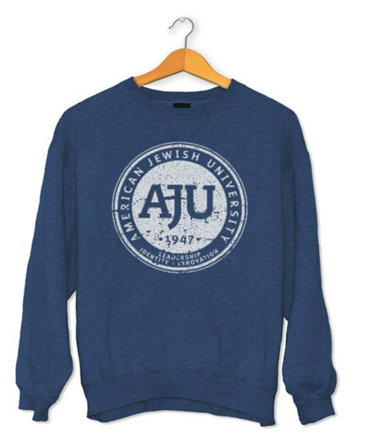
The first step was to create an AJU college seal that would serve as the primary look for the brand and that could also be amended to include each of the schools individually. This provided the cohesive feel needed for core of the project. The seal across the board: stationery, brochures, newsletters, signage, clothing, donor cards and student packets and the new face of the AJU brand.
Once completed, the seal and its elements had to be extended in exacting detail so individual schools could use them for their own needs apart from the overarching AJU communication platform. This process resulted in an Identity Usage Guide that clearly and concisely established everything about using the seal, including: terminology, fonts, primary and secondary color palettes, primary and secondary typography, and even the amount of clear space to use in and around the seal; an exhaustive graphic analysis leaving nothing to chance.

How it worked
Bringing together the voices and opinions of 10 different organizations, and parsing their ideas, criticisms, and feedback to develop a single look was definitely a challenge. Fortunately, everyone was able to keep their focus on the larger goal of having a unified look and cohesive brand and the benefits that come with that. In the final analysis the project went smoothly and was delivered within the projected time frame.