

This Choosing the right images for your website is not as easy as it looks. The first thing you need to realize is that not all images are created equal. Just because an image looks good doesn’t mean it will fit into your website’s design. You need to also consider aspect ratio and image size.
The basics
Most pictures fall into one of two orientations: Portrait and Landscape. The only exception is a square image.
Portrait images are taller than they are wide. Landscape images are wider than they are tall. Your website will usually require one or the other, based on the layout of the web page and how the image will be used. The most commonly used orientation is landscape.
Once you’ve decided on the orientation of your image, it’s time to think about its size and shape.
Once you’ve decided on the orientation of your image, it’s time to think about its size and shape.
Put simply:
- Image size will determine how big or small the image is on a page.
- Shape is determined by the proportional relationship between its width and height, which is called Aspect Ratio.
Image size and aspect ratio have a big impact on image choice. You can’t just throw any old image onto a website and expect it to look good.
Image Size
The image size comes from the dimensions of your image. To determine proper image size you need to consider how much space you want the image to take up. A logo, for example, probably wouldn’t need to take up half the width of your page, but the main photo for a blog post might have a different requirement.
If your website has a big image at the top of the page and it’s responsive to the browser width, you may only be able to consider the height of the image. If the image is part of your content, you usually have a little more freedom in choosing your image size.
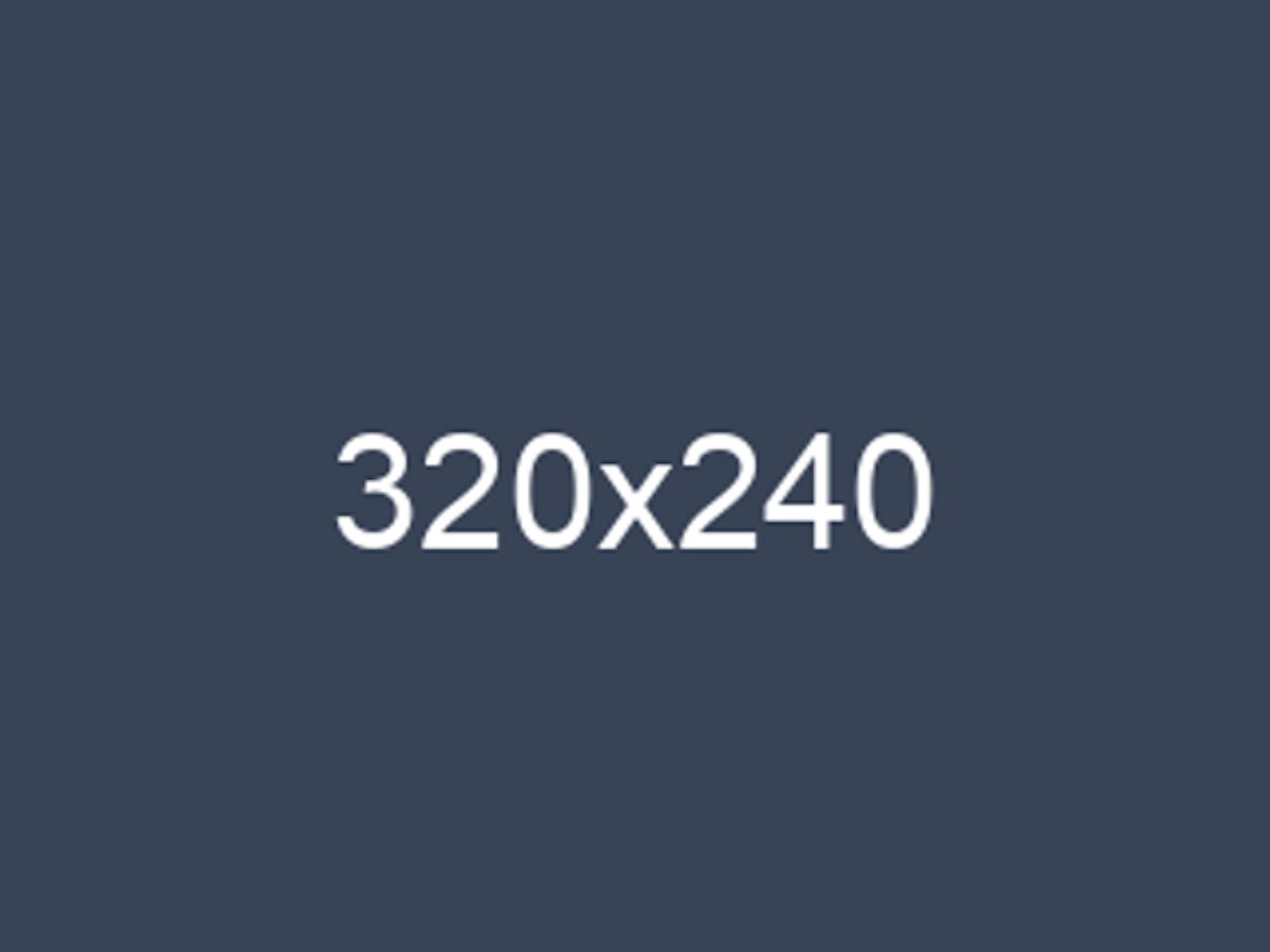
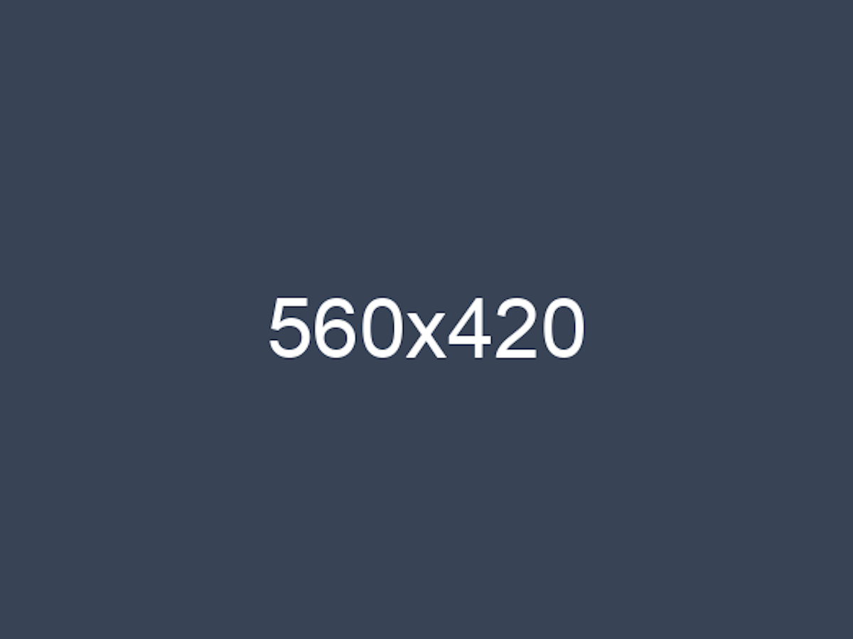
The following images have different dimensions, but are all exactly the same shape. (This is because they have the same aspect ratio, which we will discuss next).
How your website uses an image is a big factor in choosing image size. Does your site use the same image to make thumbnails, header graphics and graphics to use in posts? The important thing to remember is that you can shrink an image without problems, but enlarging an image can cause pixelation which can make the image look blurry. So think about an image’s use before settling on its size.
Aspect Ratio
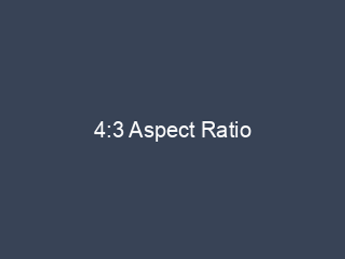
Aspect ratio is the shape of your image. Televisions are a great way to think about aspect ratio. Remember old TVs? They had a 4:3 ratio:
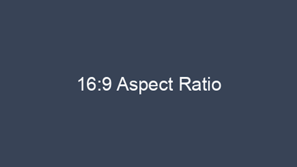
New TVs have a 16:9 ratio, which is a different shape:
Do you watch old TV shows on a newer TV? The black bars on the side of the show are there because the old show (image) doesn’t fit correctly in the new screen. Sometimes the show fills up the whole space but it hides some the show’s image.
This is a good time to consider all your uses for the same image. Your website might ask you to pick a single image for multiple uses. Your image might be used as a thumbnail (old TV show) on a blog page, but also as a large image on the post (new TV show). This is where you would apply aspect ratios to your image choice.
Picking the right image
Image size and aspect ratio have a big impact on image choice. We can’t just throw any old image onto a website and expect it to look good.
First, make sure you start with the right image size. Suppose your website needs one image that will be used in multiple instances with different sizes and different aspect ratios:
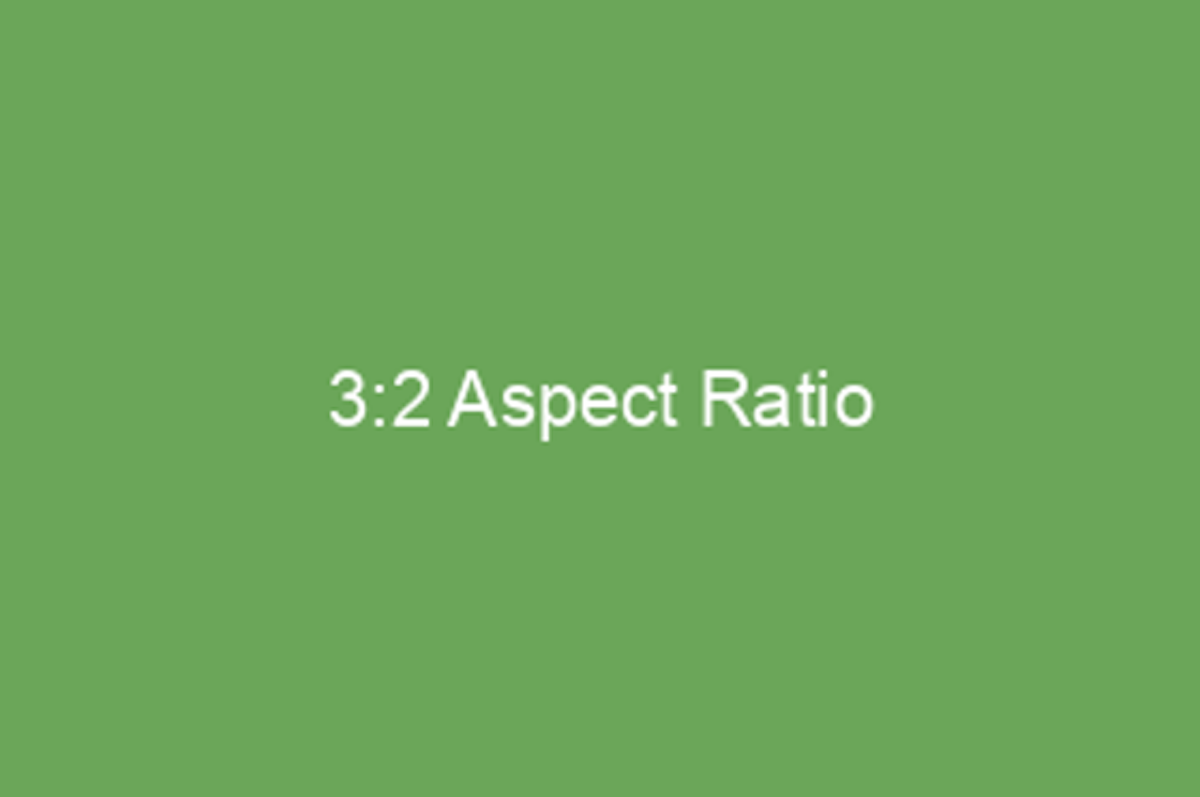
- Large header graphic: 1200x800 pixels (aspect ratio = 3:2)
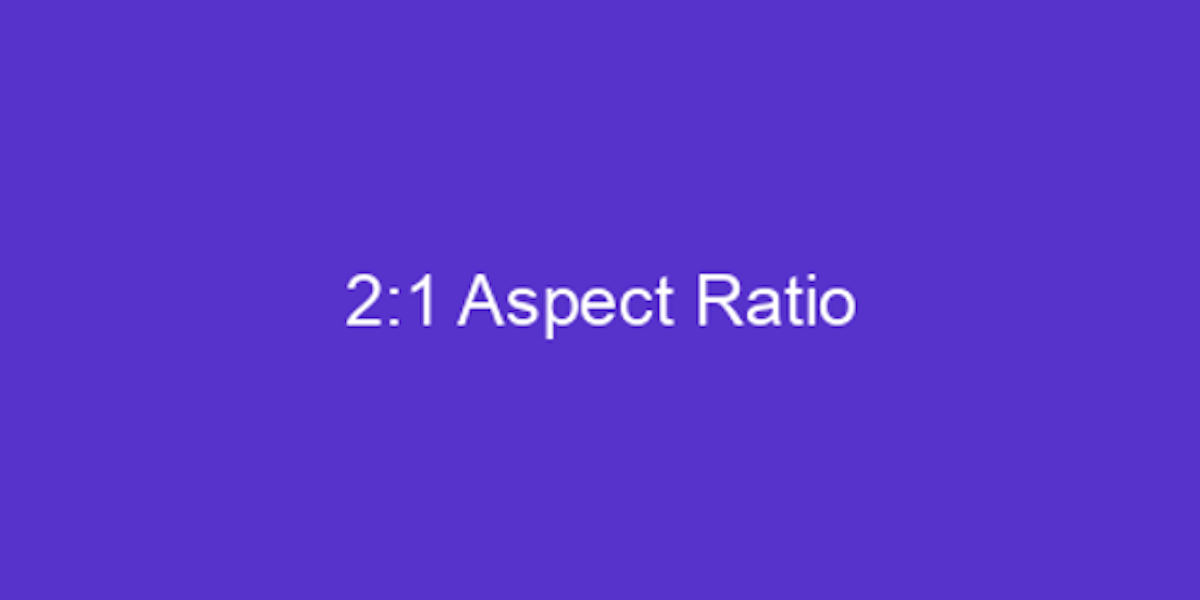
- Small thumbnail graphic: 80x160 pixels (aspect ratio = 2:1)
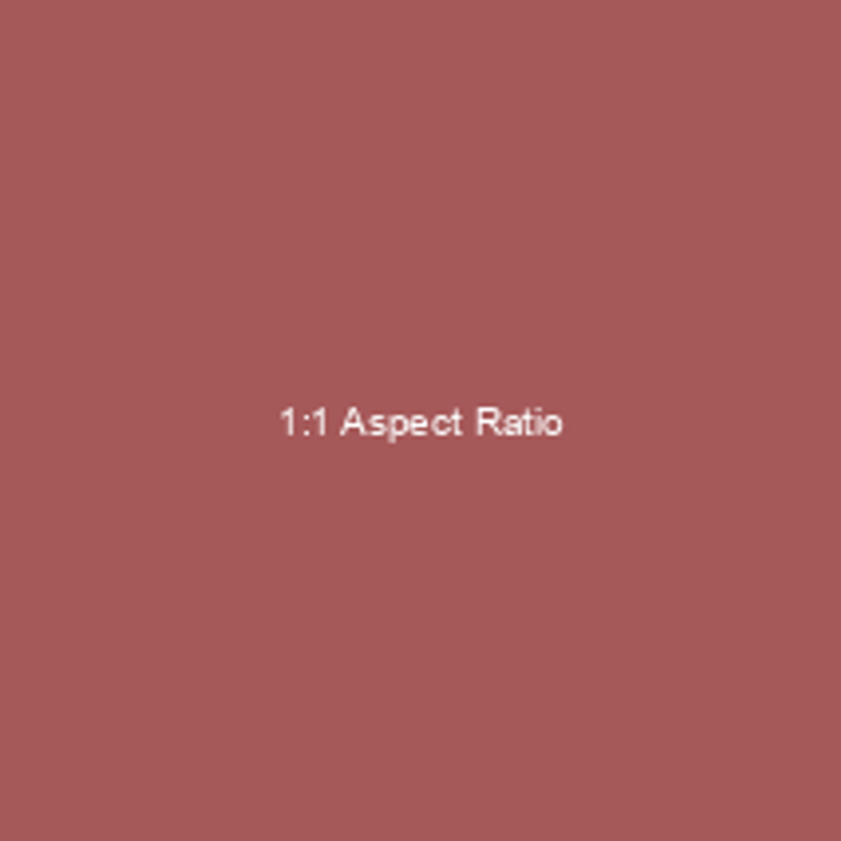
- Social media graphic: 320 x 320 pixels (aspect ratio = 1:1)
This tells you that you need to start with an image that is no less than 1200 pixels wide and 800 pixels tall. This will give you enough pixel information to reduce the image for the thumbnail and social media graphic. You should not choose any image smaller than this. (Remember: Reducing a large image for small uses is fine, but enlarging a small image causes problems.)
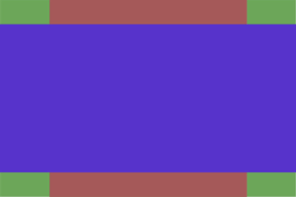
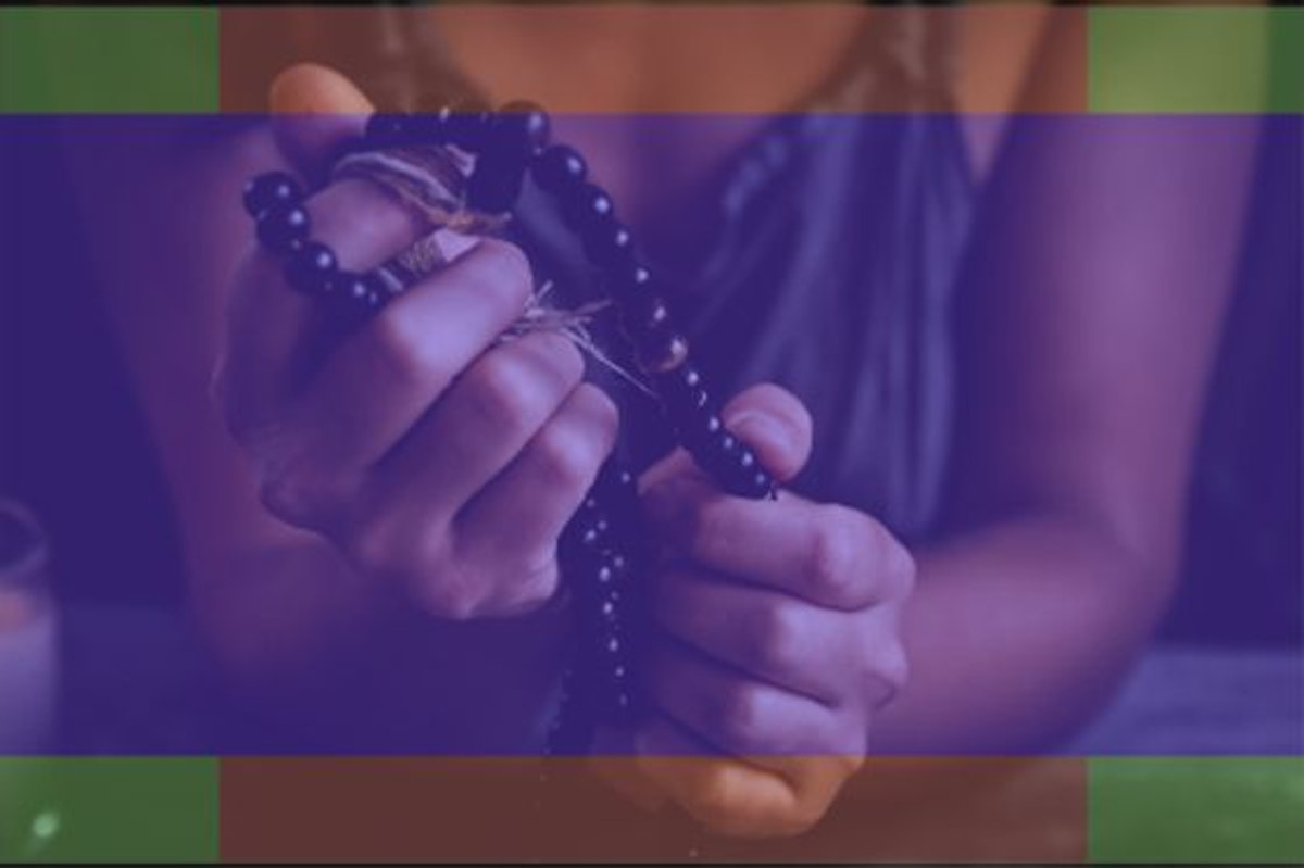
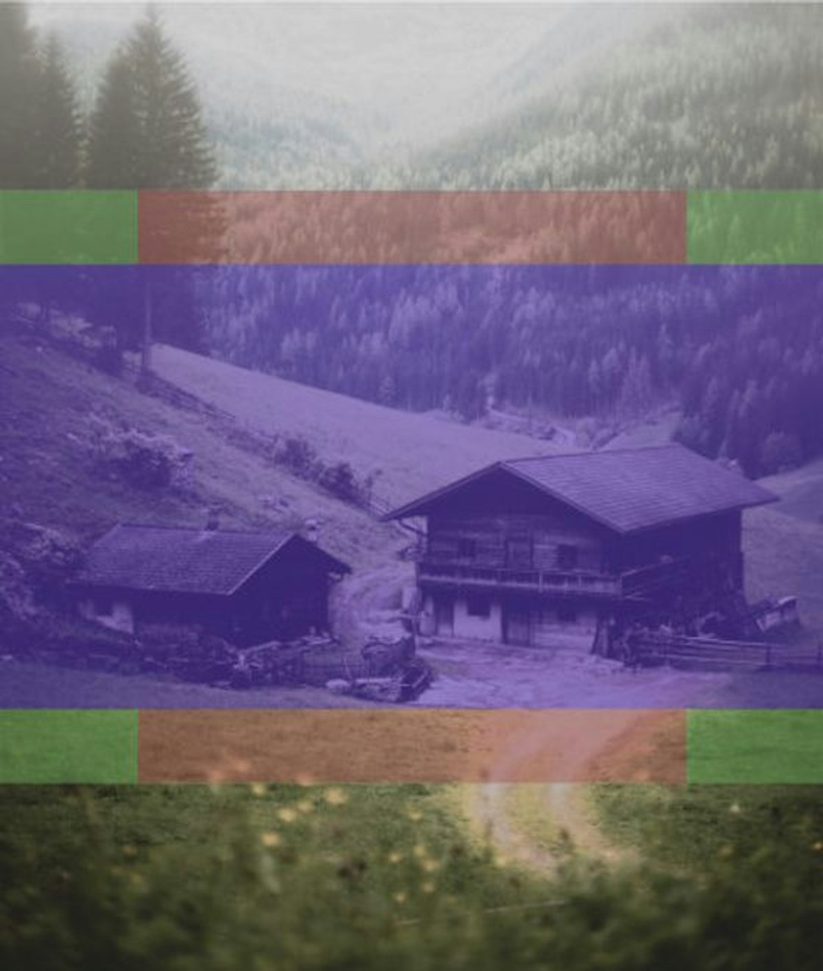
Second, you want to choose an image where the subject matter will not get cropped out when your website processes the image. Consider the images below. The first three show the aspect ratios of the large header, the small thumbnail, and the social media graphic. The fourth shows these three aspect ratios stacked on top of each other. You need to pick images where your subject matter fits into the area where all three aspect ratios intersect.
So let's see some examples using these ratios.
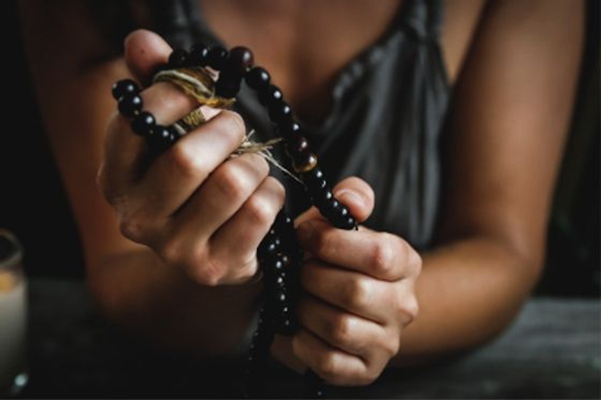
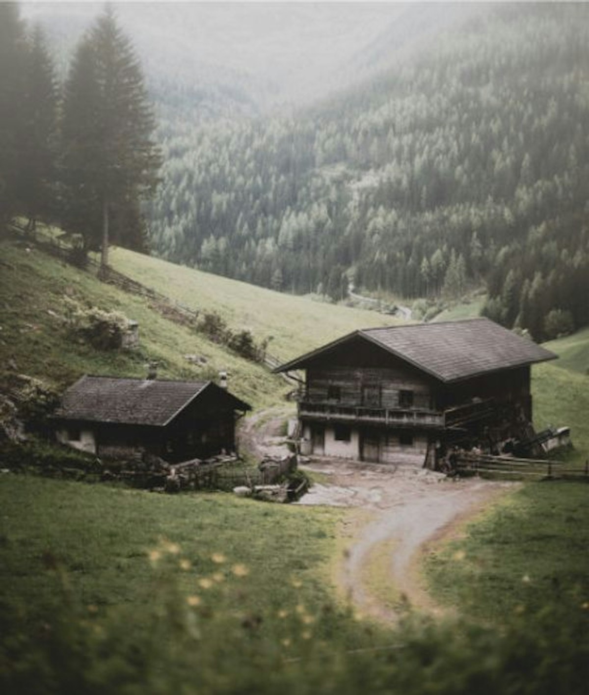
If we overlay our ratios onto this image, you can see that the subject matter is centered reasonably within the section where the aspect ratios overlay.
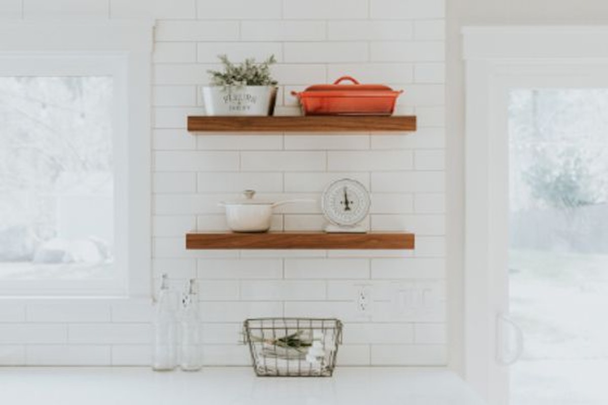
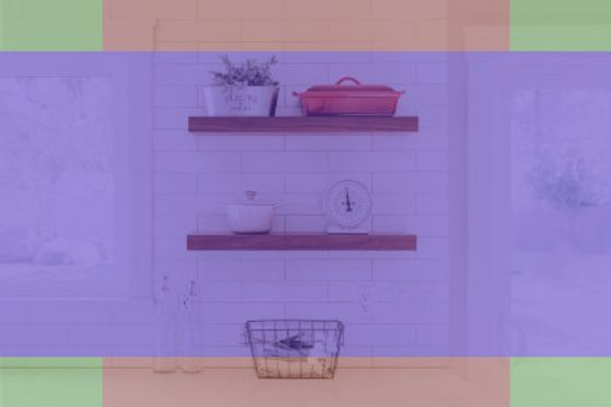
This image seems like it will work just fine, until we put the overlays on it. While it looks good when cropped for the large header and the social media graphic, the basket of eggs would get cut off in a way that looks bad for the small thumbnail graphic.
This image seems like it wouldn’t work; it’s not even the right orientation to begin with. And yet it will work, as long is it is the proper width for your usage.
With some practice at this you’ll be able to spot photos that work much more easily than the stabs in the dark you may have been taking.